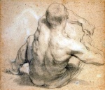
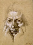
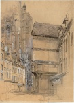
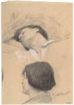
The surest path to developing your own original voice in art is to study the masters. Every great rock band you can think of started out by covering the songs of earlier artists. Great artists throughout history also “covered” earlier precedents on the way to figuring out what they were up to. Why did the Beatles study Chuck Berry and Big Bill Broonzy? Because those older artists were cool; they had the stuff, the sound, the vibe. Why did Michelangelo copy Ghirlandaio? Same reason.
When you look through the catalog of what came before you you will find your own patterns of fascination. Pay attention to these patterns. They reveal who you are as an artist and who you will be. You don’t have to know why you find a particular drawing or painting captivating. The fact that it captures your attention is what matters. It’s a mirror you’re looking at, not somebody else’s drawing. You don’t look in a mirror and ask why. You look to find information.
On the practice of drawing from the masters, Mercedes Matter, teacher and founder of the New York Studio School, said, ” Any young artist without insight into these forms of expression, without a key to understanding the art of other times and places, who is tuned in only to current ideas, is indeed poverty-stricken. However bright, sophisticated, ingenious and successful he may be, he remains, as an artist, naïve.”
In his twenties Edgar Degas spent several years in Italy living with relatives, painting their portraits and assiduously copying older art in the churches and museums. Why did he copy older art? Was he just being the dutiful student, eating his vegetables and taking his vitamins? No. He copied because that art was alive to him. It spoke to his own unique questions, intentions, and needs. History regards Degas as one of the most daring, original, and groundbreaking artists of all time and yet he himself made this confession:
“I assure you no art was ever less spontaneous than mine. What I do is the result of reflection and study of the great masters; of inspiration, spontaneity, temperament I know nothing.”
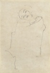
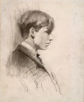
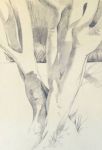
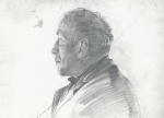
Preoccupation with finding an original style is a common curse of young artists. It’s natural to want your work to be your own and not just another iteration of some recognizable genre or established style. But shutting yourself off from art and influence doesn’t make you more original; it just makes your work more predictable and typical. It locks you out of the great ongoing conversation that all great artists, alive or dead, have had with the history of art. It cuts you off from great streams of influence that can help you in your journey to figure out what you’re doing and what you’re trying to say with your art. In the gallery below you will find some wonderful “covers” of masterworks of drawing and painting made by artists who in turn became great masters themselves. It will pay you to seriously ponder this question: did they become masters in spite of copying, or because of it?


 The Metropolitan Museum of Art")

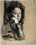
 Drawn in 1959.")


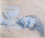
, Gesso, crayon, and pencil on synthetic polymer sheet, 12 x 9 (30.5 x 22.9 cm)")


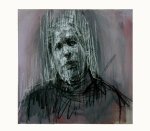
” (ca. 1966-1968), charcoal on paper, 14 x 16 inches")